What Font is Used in Museum Displays?
What Font is Used in Museum Displays?
Museums play a vital role in preserving and presenting cultural heritage, art, and history. A significant aspect of this presentation is the typography used in exhibitions and displays. The choice of font can greatly influence how information is conveyed and perceived by visitors. This article explores the types of fonts commonly used in museum displays, their design considerations, accessibility, and best practices for creating effective typographic environments.
The Importance of Font Choice in Museums
Fonts serve not only as a means of communication but also as a visual representation of a museum’s identity and ethos. The right font can enhance readability, convey the mood of an exhibition, and create a cohesive visual experience.
- Readability: Clear fonts ensure that visitors can easily read labels and descriptions from a distance. This is crucial in busy exhibition spaces where visitors may only glance at text.
- Aesthetic Appeal: Fonts contribute to the overall aesthetic of an exhibit. They can evoke emotions and set the tone for the displayed artifacts.
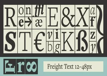
- Brand Identity: Many museums develop specific typographic guidelines that reflect their brand identity. For instance, the National Museum of African American History and Culture uses Freight Text and Freight Sans to communicate warmth and balance
Common Font Types Used in Museums
- Sans Serif Fonts
- Characteristics: Sans serif fonts lack decorative strokes at the ends of letters, making them appear modern and clean.
- Examples: Helvetica, Arial, Futura.
- Usage: These fonts are widely favored for their legibility at various sizes and distances. They are often used for labels, signage, and informational panels due to their straightforward appearance.
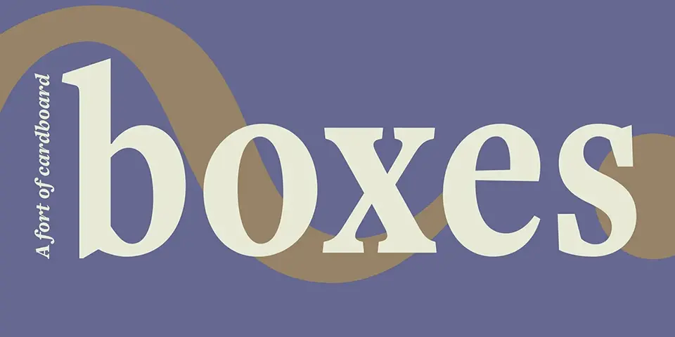
- Serif Fonts
- Characteristics: Serif fonts have small lines or “serifs” at the ends of letters, which can enhance readability in printed text.
- Examples: Times New Roman, Baskerville.
- Usage: While less common for large displays, serif fonts are sometimes used in printed materials or where a more formal appearance is desired.
- Slab Serif Fonts
- Characteristics: Slab serifs are thicker and more block-like than traditional serifs.
- Examples: Rockwell, Museo Slab.
- Usage: These fonts can provide a bold presence in exhibits while still maintaining readability.
- Custom Fonts
- Some museums develop custom typefaces that reflect their unique identity or thematic elements of their collections. For instance, the Museum of Modern Art (MoMA) has utilized specific typefaces designed for its branding
Design Considerations for Museum Fonts
When selecting fonts for museum displays, several design factors must be considered:
- Font Size: The size of the font should be appropriate for viewing distances. For example:
- Title panels may use sizes around 400 pt.
- Object labels typically range from 18-22 pt.
- Line Spacing: Adequate spacing between lines (leading) enhances readability. A minimum of 1.5 line spacing is recommended for body text
- Contrast: High contrast between text and background improves visibility. Most museums use black text on a white background for optimal readability
- Hierarchy: Establishing a clear typographic hierarchy helps guide visitors through information. Larger fonts should denote titles or important information, while smaller fonts can be used for details
Accessibility in Typography
Accessibility is a critical consideration in museum typography to ensure that all visitors can engage with the content:
- Dyslexia-Friendly Fonts: Fonts like Arial and Helvetica are often recommended due to their clarity and simplicity
- Font Size Guidelines: For accessible materials, a minimum font size of 16 pt is suggested
- Use of Plain Language: Text should be straightforward and avoid jargon to accommodate diverse audiences
Best Practices for Museum Typography
- Consistency: Maintain consistent use of fonts across all signage and materials to reinforce brand identity.
- Testing Visibility: Use the “four-foot rule”—print labels at various sizes and view them from four feet away to determine optimal readability
- Limit Font Variety: Avoid using too many different fonts within a single display to prevent visual clutter; typically one or two complementary fonts are sufficient
- Feedback Mechanisms: Regularly gather visitor feedback on signage clarity and accessibility to make informed adjustments.
FAQs about Museum Display Fonts
What is the most commonly used font in museums?
Sans serif fonts like Helvetica and Arial are among the most commonly used due to their legibility and modern appearance.
How do museums ensure accessibility in typography?
Museums follow guidelines that recommend using larger font sizes (at least 16 pt), high contrast colors, and clear sans serif fonts to accommodate visitors with visual impairments.
Can museums use decorative fonts?
While decorative fonts can be visually appealing, they are typically avoided in informational displays due to potential readability issues.
How important is font size in museum displays?
Font size is crucial as it affects readability from various distances; larger sizes are generally used for titles while smaller sizes are reserved for detailed descriptions.
Are there specific guidelines for font usage in museums?
Yes, many museums follow established design guidelines that outline font choices, sizes, spacing, contrast ratios, and accessibility standards to ensure effective communication with visitors.
Conclusion
The choice of font in museum displays is not merely an aesthetic decision; it plays a fundamental role in how information is conveyed to visitors. By prioritizing readability, accessibility, and design consistency, museums can enhance the visitor experience while effectively communicating their narratives through typography. As technology evolves and new design trends emerge, ongoing evaluation of typographic practices will remain essential in creating engaging museum environments that resonate with diverse audiences.