Karmina Handwritten Font
Free for personal use
Font Introduction

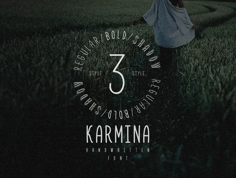
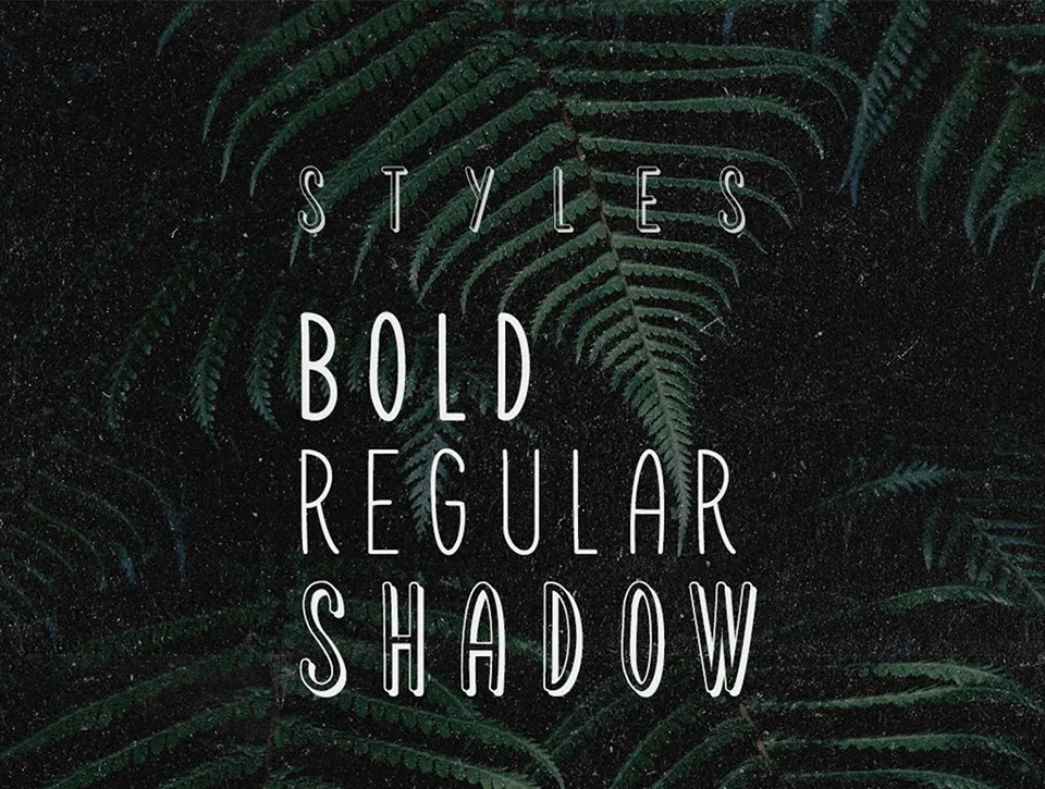
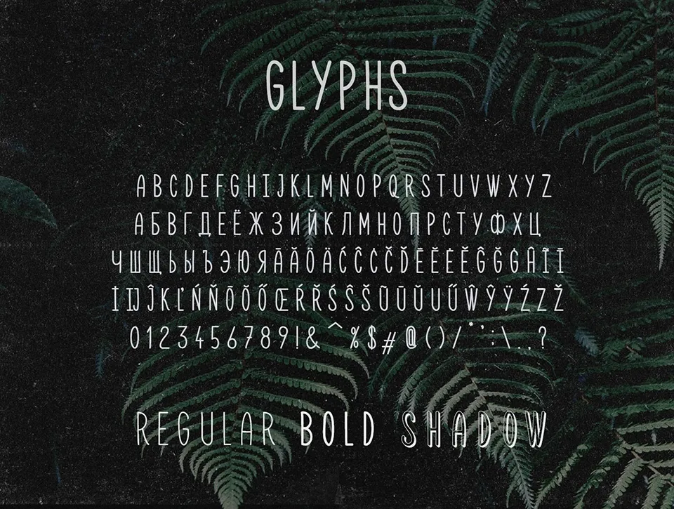
Karmina Handwritten Font is a handwritten font crafted by Dmitry Mashkin of Artcoast Design. Designed with the goal of being universally readable, balanced, and versatile, Karmina suits a wide array of design applications. It offers a clean yet personal handwritten style that supports both Latin and Cyrillic alphabets. The complete font family includes Regular, Bold, and Shadow weights, providing flexibility for various creative needs. Karmina aims to be a go-to handwritten option, balancing legibility with a handcrafted feel for diverse projects.
Designed by:Artcoast Std.Website
License: Free for personal use
Custom preview

Font Show

Hot Tags
Hot Knowledges
What Font is Used in Museum Displays?
Knowledge0 views

Best Fonts For Logos
Knowledge0 views

15 Best Sans Serif Fonts
Knowledge0 views

15 Best Signature Fonts
Knowledge0 views

What Font Does Youtube Use
Knowledge0 views

Barbie Font Generators: Add Glamour to Your Text with the Iconic Barbie Font Style
Knowledge0 views
You May Also Like