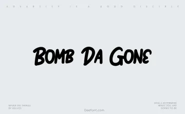
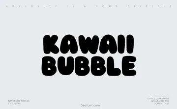
Futura Font Family
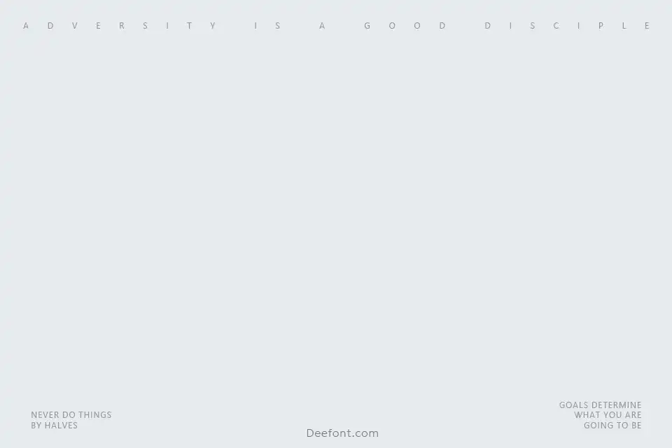
Futura Font Family is a geometric sans-serif typeface designed by Paul Renner in the 1920s, celebrated for its clean lines and modernist design. Created as part of the New Frankfurt project, Futura embodies simplicity and functionality with its distinctive low x-height and balanced letterforms. Its circular shapes and sharp angles bring a timeless geometric aesthetic that works well for both headlines and body text across print and digital media.
Key Features of Futura Font Family:
- Styles and Weights: Includes popular styles such as Futura Bold, Medium, and Oblique.
- Geometric Design: Recognizable for its precise circular forms and sharp angles.
- Versatile Usage: Suitable for headlines and body text, improving readability and visual appeal.
- Historical Significance: A hallmark of modernist typography and influential throughout the 20th century.
- Digitization: Available in multiple digital formats compatible with various platforms.
Licensing:
Futura is not free for commercial use. It is generally available through platforms like Adobe Fonts under subscription licenses. Users should always verify the licensing terms before usage.
Frequently Asked Questions:
Who designed the Futura font?
Paul Renner in the 1920s.
What are the main styles of Futura?
Futura Bold, Futura Medium, and Futura Oblique.
Is Futura free?
No, it typically requires a commercial license.
What makes Futura popular?
Its geometric precision combined with versatility enhances readability and timeless appeal.
Can Futura be used for web design?
Yes, but proper web font licensing must be obtained.
Designed by:Paul RennerWebsite
License: Free for personal use